By Justin Sanders
While shooting the film he won an Oscar for, The Revenant, Leonardo DiCaprio made headlines for the hardships he endured outdoors in subzero temperatures. But the hardest job on that film may have occurred indoors, in a room rarely thought about by people not involved with post-production – the coloring suite.
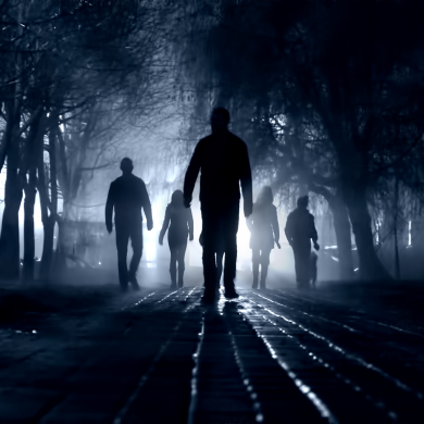
“The Revenant… took a notoriously long time to color because it was all naturally lit,” said colorist Loren White. “To match all this footage that was shot in naturally lit environments throughout the entire day, they had to rotoscope on-screen objects frame by frame, cutting out each actor’s face, clouds, skies – you name it.”
Frame by frame. On a movie that runs more than two-and-a-half hours. It makes one shudder just to think about. Fortunately for White, he wasn’t involved with The Revenant, though he has colored just about every other kind of project under the sun, including Apple commercials, hundreds of music videos, and even the most epic kind of production of them all: Bollywood films.
A relatively recent entrant in the field of Hollywood jobs, coloring – or “color grading” – is a digital art that involves creating a “look” for a project that remains consistent from start to finish. Achieving that look can entail matching a cloudy sky from one angle to the sunny sky of another, making onscreen objects “pop” such as eyes or clothing, imbuing a period feel, or a combination of all those things.
With the explosion of digital content in recent years, it’s a good time to be a colorist. “There is more work to do but there are also more people to do it,” White said. “You need to practice and work on as much stuff as you can to stand out.”
White entered the profession when digital workflows were still a mystery to many in entertainment, and found himself filling a niche that gave clients a more affordable option than giant post-production facilities such as Technicolor. He has since grown his freelance operation into a three-person company, Lookwell, that handles work from some of the biggest brands in the world.
CreativeFuture caught up with White in his office to discuss the early days of digital coloring, working in India, and how his career got kickstarted by the hit Godsmack single “Cryin’ Like A Bitch.”
JUSTIN SANDERS: Let’s start with the basics. What exactly does a colorist do?
LOREN WHITE: We create a “look” for a project and match shots together so that everything feels cohesive.
A lot of what we’re doing is bringing things out. For instance, a character might have a red scarf and we have to make sure that red is always the same shade every time it appears onscreen, and that it pops. Or, a certain character’s blue dress might have gotten mussed along the way, so it looks clean in one part of a scene and dirty in another.
There are so many variables – and you have to find a way to match all of the disparate parts.
JS: What can happen if a project doesn’t go through the coloring process?
LW: The big thing you’ll notice is inconsistencies shot to shot, and the colors won’t pop or be pleasing from a color theory perspective. Cinematographers now usually shoot in “log,” which is a color space that gives you the most latitude to work with in post. It captures lots of data in the lowlights and highlights but with that there is no shape in the image, so you really need it to go through a color grade to look normal!
JS: How did you get into this line of work?
LW: I took some media classes in high school, in San Diego, and that triggered me to want to pursue film in college. I ended up going to California Institute of the Arts (Cal Arts). For a while, I thought I would do cinematography, then I wanted to edit – but, one day, I went to a Telecine session for a student project that was shooting on film. That’s where I discovered what coloring was and then I fell in love with it and decided to dive in.
JS: What is Telecine?
LW: Digital color grading really only came into being around 2001. Before that, there was analogue color grading, which was where you would spool up film after it was processed and put it into a machine called a Telecine. The film would be printed to video tape, essentially, and that was the format you would work in. That’s what they did for years, from the early ‘80s on, before digital intermediates came around and opened up a new world of what you could with this stuff.
JS: What was it about coloring that made you fall in love?
LW: The way I look at it is that first I wanted to be a cinematographer at Cal Arts, and then I wanted to be an editor later on – coloring is like a mix of the two. I was “editing” cinematography.
JS: Was there a big learning curve or did you take to coloring naturally?
LW: I was already working in After Effects and Photoshop for a while, and color grading in those programs to a certain degree, so for me it was a really organic process. I know a lot of people who have come to color grading from an engineering or technical background and can find their way around the programs immediately, but don’t understand color theory or the artistic side of it. Once you do it for a while, you will either get it and love it, or hate doing it.

JS: Once you realized you wanted to pursue coloring as a profession, how did you go about getting work?
LW: I started coloring a lot of student films. This was when the RED digital camera had just come out, and no one really knew how to handle the digital workflows associated with them – so I started to focus on that. I kind of became a go-to person at school for coloring projects shot with the RED camera.
At that time, there were a lot of different color-suite systems that were in use at different studios. I decided that I was going to learn as many of them as I could to make myself more versatile. Once I did that, I was able to jump around and work for different companies because I could work on a variety of systems.
JS: That was very forward-thinking of you, considering you were just a kid fresh out of college.
LW: At the time, there were no freelance colorists. There were studios that had the gear, but you had to work your way in and get a job there and it might take five to 10 years. I realized there was this growing need for freelancers because there was more work happening and the systems were getting cheaper. So, I decided I would learn all the systems and be ready to jump around. It worked out.
JS: What was your first paid coloring gig?
LW: It would have been the music video for Godsmack’s “Cryin’ Like A Bitch”.
JS: [Laughs] Perfect. How did you get roped into that one?
LW: I had a reel up online. I was living with my girlfriend and I had nothing but a laptop setupin the corner of the room, and this particular client saw my reel, which was entirely composed of student films, and he brought me in to color the video at his apartment. That music video took me nine or 10 hours to see the matching and get it all going. Now a music video takes me two to four hours on average.
But it was actually a pretty big video and it definitely helped on my reel. It was a stepping stone to getting more work.
JS: Was it hard to find work at first?
LW: I was definitely hustling pretty hard early on. I was willing to work for less, so that helped me, and luckily, I was one of the few people that was doing this freelance, with my own gear. The only real option at that time was to go to a big post house for color, or clients could work with me in this new kind of setup that no one really understood yet.
So, I was freelancing in the U.S. for a while, and, then in 2011, I went to India and worked on what was, at the time, the biggest Bollywood film ever made, called Badarinath.
JS: Wait, what? You went to India and colored a Bollywood film? How on earth did that come about?
LW: [Laughs] One of the systems I had learned how to use was called Nucoda– I was one of the few freelancers who knew how to use it. This studio in India, that happened to be using Nucoda, saw my reel, and they ended up bringing me on. I got to work with this really great director of photography, Ravi Varman, who’s sort of a legend out there. It was a really great experience.
JS: What was it like coloring a Bollywood film?
LW: The thing about Bollywood films is they’re typically three to four hours long, and then on top of that there are usually six or more music videos that pop up randomly throughout the film, so it’s a lot of work. Bollywood films are definitely among the most challenging work I’ve done.
JS: Most people working in entertainment can’t say they went to India as part of their career trajectory.
LW: You really don’t see that anymore. At the time, there were just so few people who knew how to use these systems. Coloring was sort of a dark art and now it’s been way more opened up and there is a lot more local talent in India, so they wouldn’t have to bring out someone like me anymore. The same goes for work I got in China and also in Istanbul, Turkey.
JS: At what point did you decide the time was right to start your own company, Lookwell, back in the States?
LW: After all that traveling, I had a lot of commercial work and feature films under my belt. I took a job in Toronto and after I got back to Los Angeles, I found myself getting a lot of calls. I just started thinking, “Man, I have to get a studio. Everyone’s coming directly to me now – I need a place to bring it!”
So, I got all the gear I needed and I got studio space, and I grew that into bringing on an assistant and bringing on a producer. And that’s where I’ve been ever since.
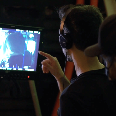
JS: What does the coloring process entail?
LW: If it’s a feature film, the client will bring their footage in and I’ll have it “prepped and conformed,” which is a fancy way of saying we just import it into the coloring system. Then I will have the client send me some references – of films or other works that they’re trying to imitate or that inspired them.
Then, I will usually schedule a “look-setting session” where, for a day or two, the client and I will go through each scene in the film – each new setup – and just try different looks that they had in mind. Once that’s done, I’ll go through on my own and take a week or so to get everything to match to those desired looks that we’ve set. Once that part is done, I’ll meet back up with the client and we’ll watch it and make sure everything’s looking the way we want it to.
It’s in these last sessions that we’ll usually make a person’s face pop more if need be, or make other important tweaks that shape the film. We can bring up certain colors and dial other colors down. We can sharpen things if they’re out of focus, or we can de-focus the backgrounds. We can even do minor sky replacements.

JS: What is a sky replacement?
LW: So, if there’s a scene between two people talking outside, and one angle has a sunny day and one angle has a cloudy day, we can replace the sky in one of them to make the two angles match. That’s a relatively new thing in the last couple years, where the software has evolved so you can do that directly in a color grading environment instead of a VFX system.
JS: I imagine that footage shot outside can pose a lot of challenges because weather is so temperamental.
LW: Naturally lit stuff is always difficult. Footage that was shot in a studio, with controlled lighting, can be the easiest to color of all. You can color that stuff in a couple of hours. The naturally lit stuff, though…
The Revenant, for instance, took a notoriously long time to color because it was all naturally lit. To match all this footage that was shot in naturally lit environments throughout the entire day, they had to rotoscope on-screen objects frame by frame, cutting out each actor’s face, clouds, skies – you name it.
Shout out to The Revenant colorist Steven Scott and his team for an incredible job!
JS: It’s almost as though the harder stuff to color is the stuff the viewer would never think about. A daylight shot, for instance, seems pretty straightforward on the surface.
LW: Exactly. It’s always the boring, daytime, natural light that’s the most difficult. And ironically, the longer you do color work, the easier the work that comes to you gets. When you’re starting out you get a lot of naturally lit stuff that you’re not really prepared to do. [Laughs] There’s no money in it and it needs a lot of work.
Later, when you’re more established, you start getting bigger stuff, like an Apple spot I did called “Let Your Red Out”. It looks really complicated but it was shot in a studio, so the footage was very consistent. There were creative challenges such as knowing how much to pop certain colors so that it looks tasteful, but from a technical standpoint it was relatively easy.
JS: What if you want to make footage look like a completely different time period or pay homage to an older style of film?
LW: If it’s a feature, the client will sometimes say early on, while they are still filming, that they want to create what’s called a “LUT”, which stands for “Look Up Table”. It’s a reference that they can use during the shoot to view what the film will eventually look like after it’s been colored. In many cases, a LUT is the starting point for the look on a film.
To create a LUT for a period project, I’ll sometimes literally bring in a still from the film or the time period the client is trying to allude to. With the tools we have now, you can basically match anything.
JS: Will you ever receive a project that is coming off of a disastrous shoot and needs you to “save” it?
LW: Definitely. I just did this one that was shot on 16mm film, and about half of it was shot really well and half was really underexposed. We had to get the good stuff to match the bad stuff. We couldn’t bring the bad stuff up to match the good stuff, so we had to push the underexposed stuff as much as we could and then bring the well-exposed stuff down to match it.
JS: Your portfolio includes work for some of the world’s most iconic brands – for instance, you colored a Celtics spot that played on the jumbotron during their games at TD Garden. Do you feel extra pressure getting the colors right for clients like that?
LW: Yeah, there’s definitely a lot more sensitivity to the iconography of the branding. Almost all commercial work I do, the client will bring in a package from the given product’s factory that is the absolute perfect version of it. For example, Coca-Cola will bring an ideal Coke can from the factory that has no Coke in it – it’s like a $10,000 object that we’ll use as the reference for the color red on the can in the spot. That physical object gives you a chance to put the real-world version of the color under different lighting to see how it would really look in sunlight vs. shadows, etc.
JS: What is your favorite type of project to work on?
LW: I really enjoy commercials because they offer a new challenge every day. Usually, the client comes in, it’s a four-hour job, and by the end of it you’ve created a whole new world for that piece. Then you’re off of it and you’re on to the next thing. It’s very creatively satisfying.
JS: That runs contrary to the idea that commercials are the money gig while films are where one gets artistic fulfillment.
LW: Features are a lot more work. The emotional payoff can be better in terms of being part of a narrative thing, but it can definitely be taxing for a colorist working on longer-form projects. You’re working with a lot of the same footage over and over and over.
But, at the end of the day, they can both be really rewarding – just depends on the project!

JS: What advice would you have for someone who wants to do what you do?
LW: Learn to do as much as you can. The more you can bring to a team or a company or a project, the better. In the next five years, we’re going to see a lot of colorists doing more than just color. There’s going to be an expectation that you are able to do a quick composite or a quick sky replacement, so having those skills will help get you over the edge.
And then, you just need to practice color and work on as much stuff as you can. You can do student projects, or there are even websites – like Mixing Light, the Tao of Color, and International Colorist Academy – where you can learn the basics and practice the craft. It’s really important because when you’re working with professionals, they will expect you to be very fast and efficient. The faster that you can dial in to what a client’s asking for, the better.
You also have to be pretty comfortable with someone sitting over your shoulder for hours at a time. And, you have to be okay working alone, in the dark, for 14 hours at a time. Some clients want to sit with you through the project and some want to be hands-off. You have to be very patient and you have to be able to interpret people’s ideas. You have to enjoy working with people in general, I think, and yet you also have to be self-starting.
[Laughs] Basically, to be a great colorist, you kind of have to be an introvert and an extrovert at the same time.
Photos courtesy of Loren White